
Most app developers aim to have an engaged user base who find their app valuable and return to it on a regular basis. Also, anyone who’s ever bothered to hit the ‘install’ button hopes that the app delivers on it’s promise to fulfill a need, or solve a problem!
Blindly optimizing engagement metrics for their own sake isn’t consistent with reaching long-term business goals, and the goals of people using your product. Trying to successfully retain existing users over trying to acquire new ones makes monetary sense, as poor retention leads to higher acquisition costs.
In this article I will recommend ten ways to optimize for a successful, engaging app, which includes some insights shared at the Google Play, Sustainable Engagement Day in 2018, and Playtime 2018. You can also watch the full event session below.

Tip 1 — Meaningful features and analytics
Health app Lifesum asked themselves: “how do you know if you’re improving your product?”. Retention and conversion metrics are great ways to measure whether feature usage is improving, but these ‘vanity’ metrics don’t always take into account how users actually experience your product. According to Lifesum’s ex-senior designer Rafael Coimbra, improving features does not necessarily translate into making your user base more successful.
At Lifesum, it was clear there were lost signals between the in-app behaviors of users, and their reasons and motivations. Rafael created a generative worksheet to better measure meaningful behaviors and identify driving reasons and values of its customers. You can check the Meaningful Analytics worksheet here.
Similarly, a core user action for dating apps is typically the number of conversations users initiate and the amount of messages they send each other. Badoo product manager, Timur Garifzyanov, explained at Playtime (see video above), how they experimented and saw an increase in the number of chats started in their app by adding a feature whereby people could send hearts to each other to start a conversation.
This feature resulted in a positive 20% increase in the number of messages sent, but the reply rate was very low (at -6% for males), and the retention for female users decreased to 1%, as reported by Badoo.
It became clear thatmeaningless conversation starters did not help people achieve what they expected from the app. To fix this, Badoo introduced a new feature called the ‘bad opener blocker’ which made it actually harder to send meaningless messages. This resulted in less messaging overall, but more meaningful conversations between users, and a better reply rate.
Tip 2: Data can tell you where the problem is…
How do you measure the efficiency of your app based on what your users want to achieve with it? The language-learning app ABA English believes data can only tell you where the problem is but not what is about. That’s why they decided to identify and leverage qualitative data coming directly from people using their app. This led them to add an additional step in their onboarding process and subsequently achieve 2x increase in user activations.
How? During the onboarding ABA users were asked to select their language level before starting with the content. ABA’s quantitative data showed no major drops at this stage.
However, customers interviews showed that users didn’t know how to really assess their language knowledge. This led to churn later in the funnel and low engagement if the wrong level was picked. ABA then took the potentially counterintuitive decision to make their onboarding longer and by including the additional level test their users activations doubled up!

Tip 3 — The ‘ultimate’ way to communicate with your users
The team at Ultimate Guitar foster a culture with human-to-human communication at its core that’s not the sole reserve of the customer support team.
They created a human to human “H2H” board where the entire team can see all mentions of Ultimate Guitar on social media. At 10am everyday, there’s a strict “no code, no design, no meetings” rule, and the team, from designers to developers to analysts, communicate directly with real customers.

Ultimate Guitar’s COO Mikhail Trutnev believes that implementing this human-to-human approach helped ensure that “product teams started to empathize with our users. And this, in turn, had led to the team protecting product users from overly aggressive marketing campaigns even if they were deemed effective”. The team does not even consider some monetization ideas and only comes up with experiments that go in accord with H2H principles, thanks to this empathetic approach. As a result of this, Ultimate Guitar has reported an increase in revenue and decrease in negative feedback simultaneously.
Tip 4 — Start where your users start
By watching replays, tracking a leakage map, and identifying that their paywall was often interruptive to the learning experience, language-learning app Busuu realized that they had a problem with their first-time user experience.
Their hypothesis was that there was a lack of consistency starting with the Google Play Store assets. By focusing too narrowly on granular changes to copy and styling with metrics that were detached from their outcomes further down the funnel, the value proposition was hard to understand and so they had to fix it.
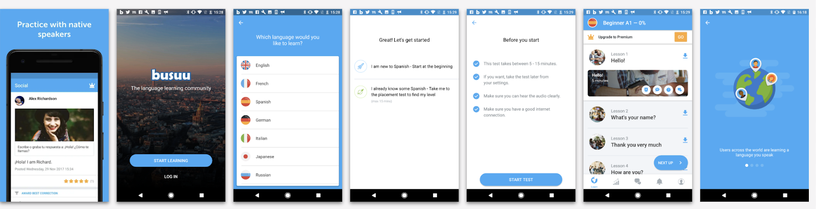
Following Samuel Hulick’s recommendations and referencing his Useronboard.com onboarding checklist, they created their own first-time user experience principles:
- Consistent imagery & recurring themes (starting at the Google Play Store)
- Showcasing the Premium option early (coupled with a free trial)
- Removing distractions (progressive disclosure)
- Celebrating progress
- Unlocking more content based upon activity
- Setting expectations and getting commitment
Several experiments later, they have been able to make incremental gains to key metrics such as download > registration rate and friends added/accepted increased. Throughout this iterative process, the team regularly watches videos, runs tests, and ideates/hypothesizes to ensure they’re constantly evaluating the first-time experiences of real users.
OneFootball also understood that successful activation is critical for optimizing their retention rates. A key activation metric is ‘users with a favorite team set’, as users who have a favorite team have higher 7/14/30D retention rates than those who don’t.

OneFootball’s main takeaway is that activation factors should only be measured based on the impact they have on short and long-term retention.
Tip 5 — Give your users a head start
Especially true of the early stages of the user experience, typically there’s a set of core tasks users must complete in order to derive value from your app. Last year, Antony Ribot spoke at Google Play Playtime event about how to integrate behavioral thinking into your app design process.
One key concept he referenced was the “endowed progress effect”, which provides people with a feeling that they’ve made a great start already. This is inspired by findings from a study (The Endowed Progress Effect: How Artificial Advancement Increases Effort, by Nunes and Drèze in the Journal of Consumer Research, Vol. 32, №4, in March 2006), which tested how prefilling car-wash loyalty cards with two stamps affected card completion by comparing a card with eight stamps (and zero pre-marked) to one with ten stamps (with two pre-marked).

The two pre-marked stamps on the 10-stamp card conveyed certain steps of a task as already complete, reframing the task as one that is in progress but incomplete, rather than not yet begun. This in turn increases the likelihood of task completion and can also decrease completion time.
To apply this principle to your product, consider visually denoting progress as a partially completed list of ticks, even if the tasks users have completed are as simple as opening the app and signing up!

Tip 6 — Personalize push
One of the core goals of the shopping list app Bring! is to help users stay organized. So how did they go about this?
- They created a session model.
- This learns the typical behavior of their users.
- Then, if the session model detects an anomaly (e.g. someone didn’t fill out their shopping list at a predicted time), a personalized push reminds the user “here are some ideas for your shopping list”.


Tip 7 — Identify additional app use cases
To make their app as useful and as engaging as possible, Hostelworld wanted to go beyond the booking (the app’s core transactional use case). To identify additional use cases and rethink the customer journey, they made use of Think with Google’s research on travel micro-moments.
One of the core features they created based on this approach was the new Hostel Noticeboard. Hostels are able to add local events through the Hostelworld inbox, and in turn this information is used to enhance the customer journey through being surfaced in the app using an Events API, as well as yielding more personalized push notifications and the ability to integrate with the customer’s calendar to ensure they don’t miss out!

In addition, Hostelworld knew that many of their users were solo backpackers. To create more meaningful experiences for their customers, Hostelworld used the Google Cloud Translate API to create the “Speak the World” translation feature which enabled travellers to speak 43 global languages. The feature garnered success, sparking 3.5 million conversations since launch as reported by Hostelworld.

Tip 8 — Implement LiveOps for apps
Game developers have been successfully re-engaging their users in the form of LiveOps. Put simply, LiveOps involve running “games-as-a-service”. This means the game becomes a dynamic product that is constantly changing, giving players new experiences each day. The goals of LiveOps are to augment engagement, stimulate monetization, and to reduce player churn. We see three key components to LiveOps: content, sales and events, and this combination has proved to be very successful.

For example, the innovative language learning app Memrise ran a back-to-school offer to motivate users at the start of the new school year. They released beginner and advanced courses for new language combinations and ran a global campaign offering a discount for their annual subscription, which led to additional engagement and a reported 32% increase in revenue.

Tip 9 — Community and comparison
Runtastic’s goal is to help every individual live a more aware and active lifestyle. One of the core services they provide within Runtastic Running is community and comparison via their Groups feature.
This feature not only creates a sense of community within the product itself, but allows users to engage in friendly competition through the Group Leaderboard feature. The team found that users in a group are more likely to be regularly active and significantly less prone to churn.
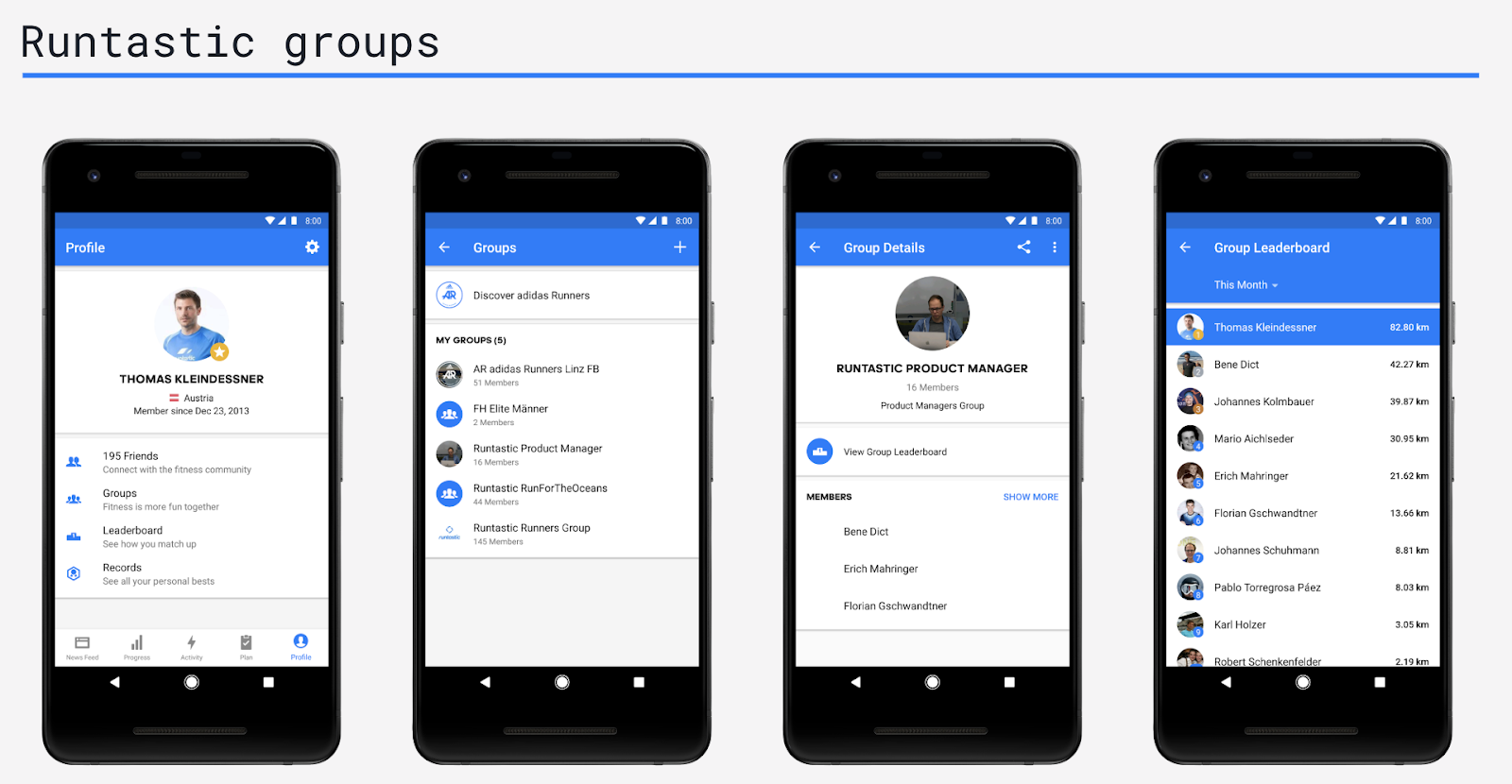
To implement leaderboards within your app successfully, consider the following:
- Position the user in the middle of the leaderboard where possible (so they see the user/player above and below them).
- Keep leaderboard results fresh by considering the right cadence of updates
- Comparison features are most meaningful when players are on the cusp of beating others, or at the brink of losing!
- The N-effect suggests that increasing the number of competitors can decrease competitive motivation, so limit group size by time/location, or both, or create micro-leaderboards (e.g. users’ friends or similar people).
Tip 10 — Don’t forget about the basics
Ultimately, people using your product do not care about engagement statistics, but about what value your app brings to their lives.
At the 2018 Playtime event, communication app Truecaller explained how they achieved an impressive 30% increase in DAU/MAU thanks to a mix of new features launches like messaging, notifications, and improved launch speed.
While doing so they also learnt a few important lessons:
- Don’t forget about key Android Vitals stats when adding new features, for example crash rate and wake locks could bring more uninstalls and lower ratings.
- Think carefully about how you’re educating your users about new features via notifications as people don’t want to feel overwhelmed by them.

I hope these tips from a wide range of app developers have conjured up potential improvements you can make to your own app.